
Dee Dee Zorgt
Identity
Stationery
Website Design & Development
2022 — 2023
Empathetic yet pragmatic, that's Dee Dee, a psychiatric nurse who has launched her own practice in the summer of '22. Being a family friend for over 20 years, we were happy to help her out with her branding and website.
More often than not, people with mental problems are on the waiting list somewhere or are being sent from pillar to post. For these people that can't seem to get the help they need, Dee Dee offers a listening ear that's available at all times.
As a mental health professional, she helps people with a mental variation who feel alone and unstable, guiding them to find peace of mind and regain control of their own lives.
Together with concepting & copywriting skills of Pozy, we've created a visual brand identity and website for Dee Dee.
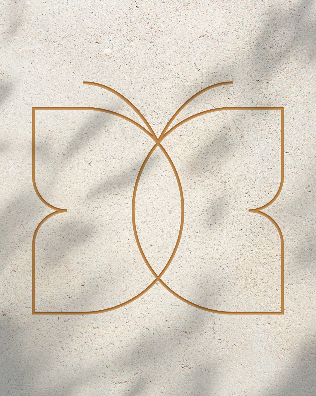
The logomark consists of several elements. The butterfly represents transformation and freedom, something the clients of Dee Dee will hopefully achieve after working with Dee Dee. Two overlapping circles represent the connection and empathy between Dee Dee and her clients. Lastly, two D's are the initials of Dee Dee. Together, these elements form a logomark that's filled with meaning that resonates with the core of the practice.
We paired the logomark with the typeface New Kansas. The geometric shapes and clean lines of the logomark contrast nicely with the soft and friendly appearance of this typeface. The same typeface is used for headers and for body text, we picked the sans-serif Sen, ensuring a more modern appearance.
For the color palette we picked a set of neutral but earthy shades of brown and beige. The sound of rustling leaves in the wind and the soothing smell of lavender, that's the feeling we wanted to evoke by choosing different hues of green and purple as additional colors in the palette.
After that we continued with creating a set of custom icons that represent different aspects of Dee Dee Zorgt.
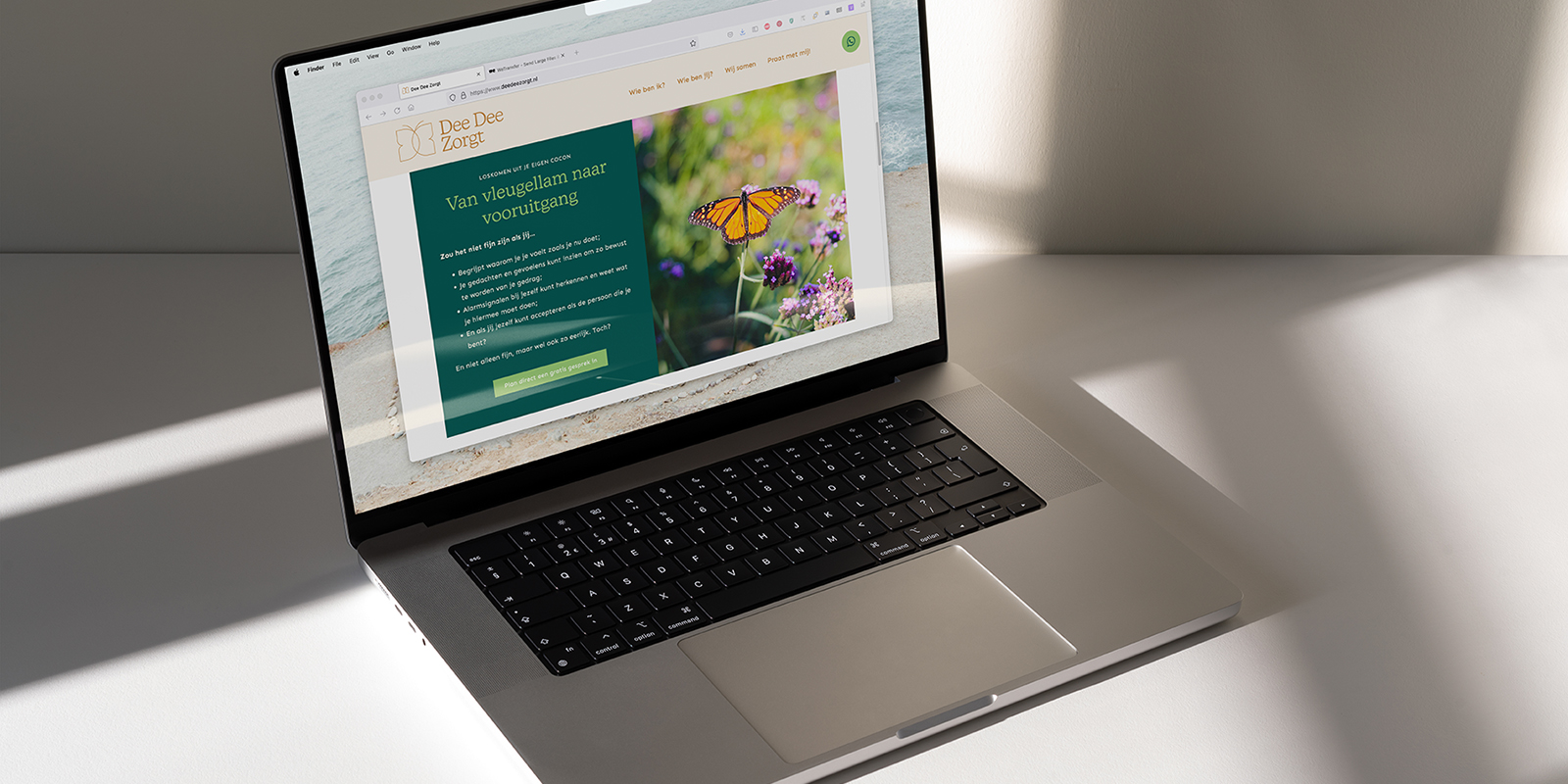
When the foundation of the brand identity was set up, we moved on to the website. The goal was to give it a clean, clear but warm feeling. Informative, but not too busy.
Dee Dee herself has tons of experience in the field of psychriatic care and has plenty to tell you about it. It was with the help of Pozy that we were able to channel all this information into clear story.


kind words
I really enjoyed the collaboration because of the very clear communication. Sebastiaan is very incredibly creative and sensed very well in this what I wanted and what I needed. Besides that, he thought along with me, which I really liked. He was also flexible with his time when I had questions.
I am extremely happy with the end result! I didn't expect beforehand that my logo, branding and website would turn out so beautiful! All thanks to Sebastiaan. I must also say that I get a lot of compliments on it. I would highly recommend working with Work & Dam!
dee dee heijn
founder dee dee zorgt


Ready to raise your brand to the next level? We'd love to get to know you. And if there's a match — We'll be sure to make some dam good work.
Send us your dreams & memes at:
Email: hello@workanddam.com
