
Fear is Overrated
identity design
branding
2020
Fear is Overrated is there for the young urban professionals that want to do it all: the perfect career, travel the world, join every party, work out, eat healthy and in the meantime plan out the future. When these ambitious people ask too much of themselves, lose focus and experience an overload of choice, FIO is there to support.
With the launch of this practice of a social psychologist & coach based in Amsterdam, an identity was required that reflects its gentle & compassionate spirit. The obvious connotation with fear, things like monsters, serial killers and other horror things is not what Fear is Overrated is about.
What FIO refers to is a more abstract and internal fear, such as fear of missing out, rejection and not living up to your potential. These fears are more human, serious and frequent. Therefore, the visual identity required a more elegant and mature approach on how to visualise the essence of the practice.
A starting point that stuck was the idea of light and shadow representing the internal struggle with fear and overcoming it. Being in the light represents feeling good and the shadow represents negative feelings such as fear. This was something we could incorporate in the design without being to overtly cliché.
We went on by looking analytically at what exactly is being said with Fear is Overrated. What does it mean?
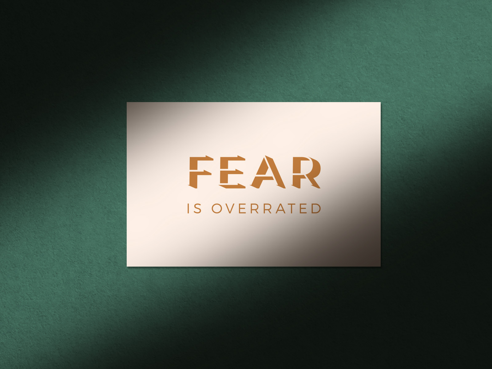
Fear – is – overrated.
This statement implies that fear may seem like something big, while in reality, it isn’t that big at all. We came up with a way to visualise this statement.
We have first set the word ‘fear’ in a light-weight, sans-serif font. By adding a shadow to it, we added weight to the overall form to make it seem way heavier than it is. The next step was deleting the original type, making the word Fear only readable by its shadow.
In this way, typographically we visualised the act overrating: something may seem big, but in reality it isn’t. Fear is Overrated.
By combining the concept of light and dark with the act of overrating in typography, we were able to visualise what Fear is Overrated is all about: something might seem big and therefore frightening, while in reality, it is not.
Besides translating this key proposition of FIO into design we have consciously chosen serene colors to evoke feelings of peace and calmness. A color palette with a mature appearance, which is specifically at odds with the colors that are daily associated with fear.
By the way: did you know that the word FIO also means "to become" in Latin? We are certain that we have created an identity that has become what it should have been.


Ready to raise your brand to the next level? We'd love to get to know you. And if there's a match — We'll be sure to make some dam good work.
Send us your dreams & memes at:
Email: hello@workanddam.com
