
Innovation
Boosters
BRAND IDENTITY DESIGN
BRAND GUIDE
WEBSITE DESIGN
WEBSITE DEVELOPMENT
DECK TEMPLATE DESIGN
2021
When your company or organisation is stuck, slow to adapt or simply in need of some fresh energy, who you gonna call? That's right: the Innovation Boosters.
The Boosters bring organisational methods, technological support and most of all, their can-do mindset for companies and organisations that are in need of innovation.
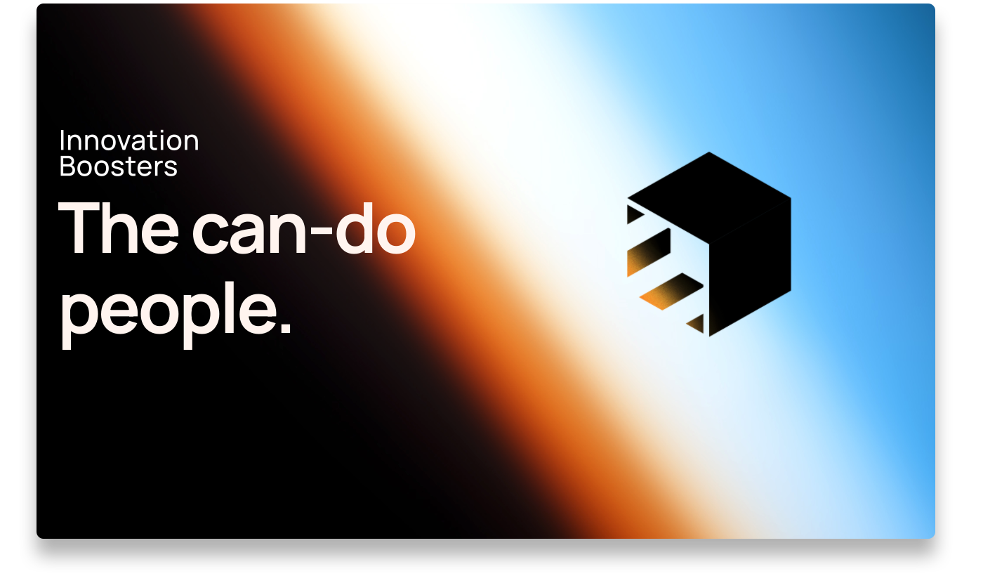
As the result from a new strategy laid out for them, Innovation Boosters needed an update to their brand identity and a brand new website. The keywords for this? Bright, bold, fresh.
After several conversations and an exploration in different design concepts, we laid down the options on the table. In the end, we decided to stay close to the old logo design.
We cleaned up the logomark by making it isometric. That's maybe a unfamilair word so allow me to explain: the logomark is based on a cube and when this is isometric, it means that this cube is from an angle where every side of the cube is the same size. By doing this, we ensure a more balanced appearance for the logomark.
Since this identity would mostly live in a digital space, we had the opportunity to use bright RGB colors and gradients, for a look that's bold, bright and fresh.
For the logotype, we picked a more modern and versatile typeface. By not setting the name in all-caps, the logotype feels more friendly and approachable.
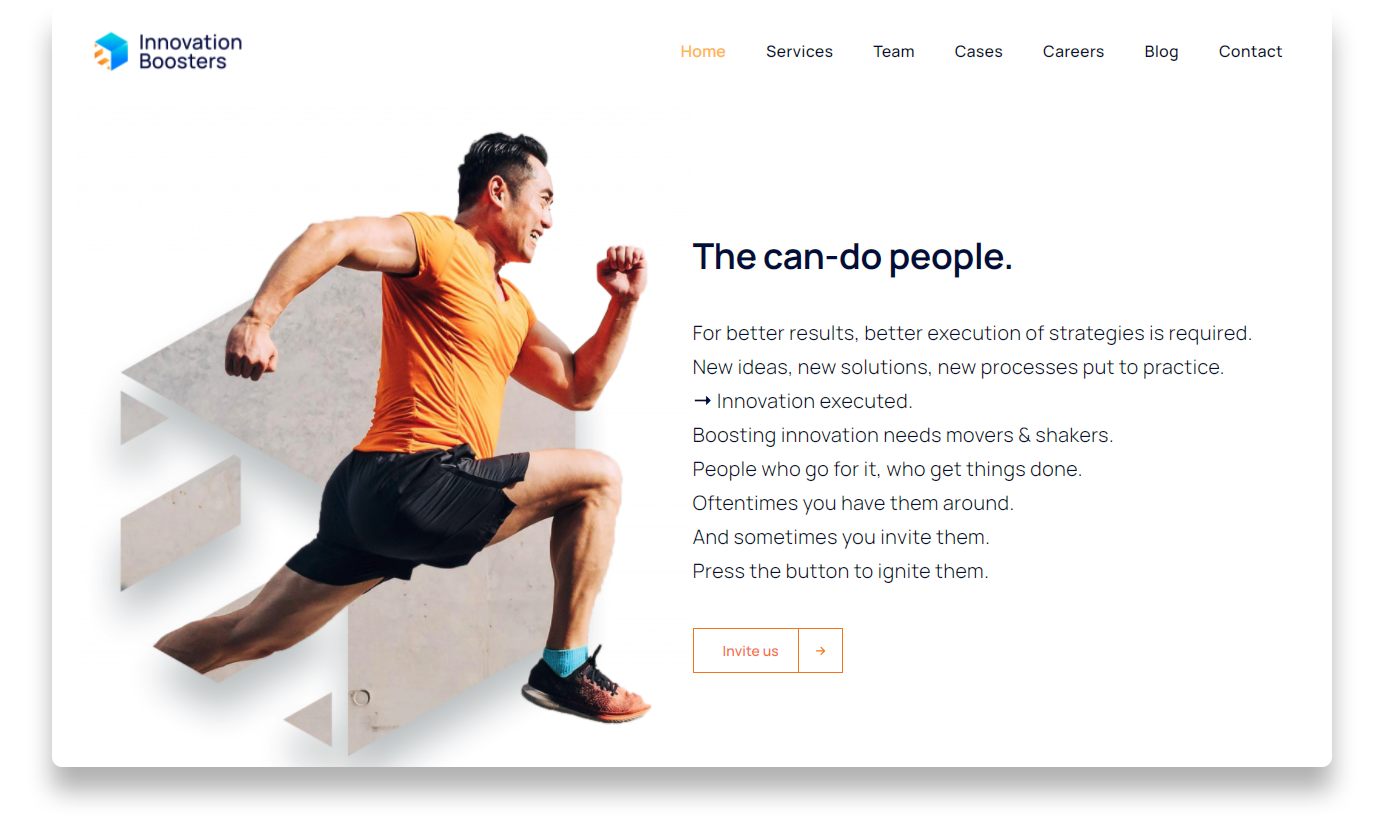
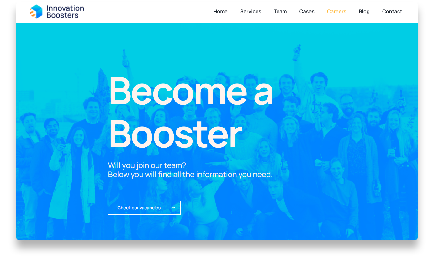
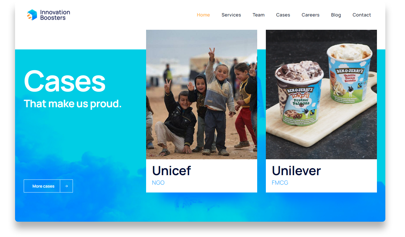
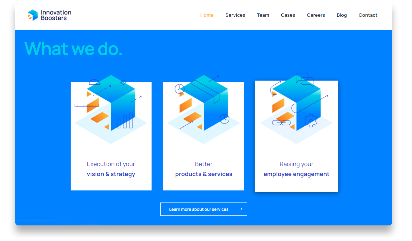
After the identity was set up, we designed and built the website. We can can write a lot about it, but sometimes a website says more than a thousand words. Go have look.
Brand identities need to work. And in order to make sure that everyone know how to work with it, we've made a visual brand guide, a document that outlines all visual elements of Innovation Boosters, including its logo, color palette, typography, imagery, and other design elements. It serves as a reference tool for all stakeholders so that the brand is consistently & effectively represented across all marketing and communication channels, both online and offline.
And with that, the Boosters were ready for lift-off.


Ready to raise your brand to the next level? We'd love to get to know you. And if there's a match — We'll be sure to make some dam good work.
Send us your dreams & memes at:
Email: hello@workanddam.com
