Wanderlust
Strategy
Identity Design
Packaging
Copywriting
2020 — 2022
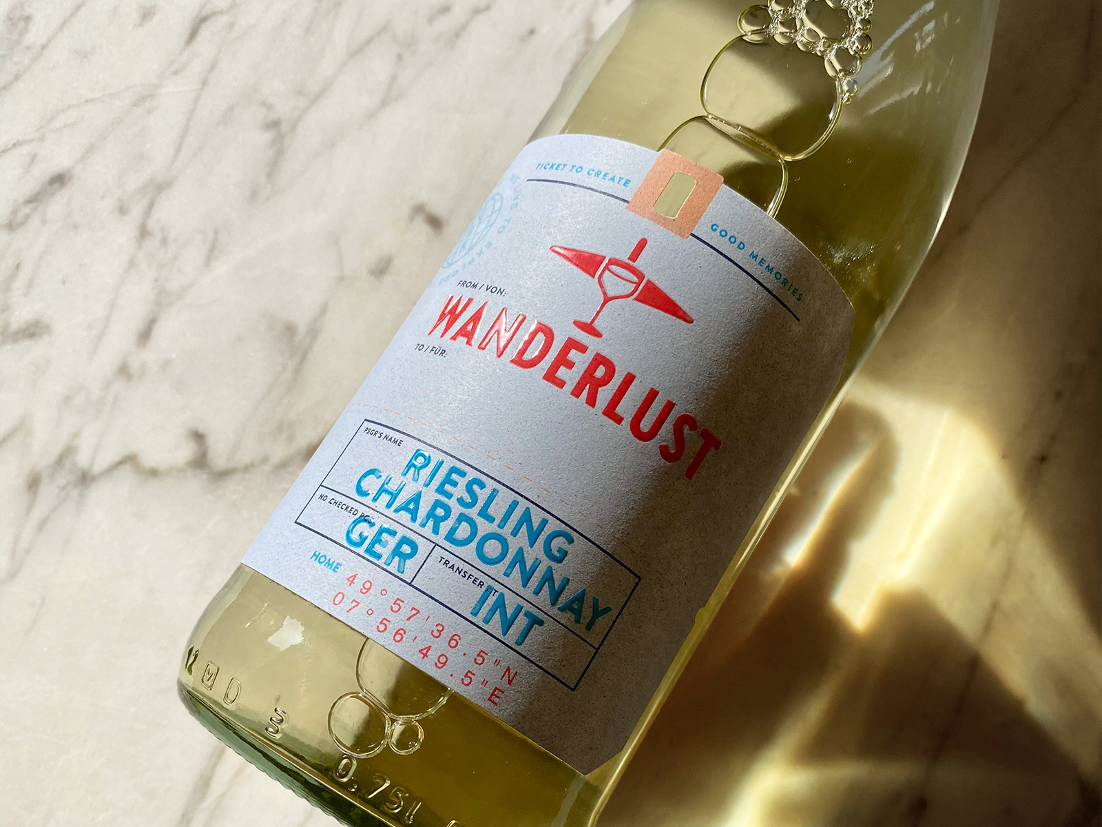
Although this German wine brand initially came to us for a label design only, we ended up delivering a complete strategy, brand identity, packaging design & copywriting.

The client requested some ideas for a new wine label. However, the only given things were the name, which was Wanderlust and their target audience, Millennials. After some talks the client agreed for us to develop a strategy for them. This enabled us to clarify what the brand is, how it can position itself in the market and why it should matter to the target audience.
After the strategy has been set up, we started our research as a foundation for the design concept. Diving into the etymology was the first step.
Wanderlust is one of those German words with such a specific meaning, it's been adopted into English: a joy ('lust') or passion for hiking. It can be literally translated as 'enjoyment of hiking', although it is commonly described as 'enjoyment of strolling, roaming about, or wandering'. The first documented use of the term in English occurred in 1902 as a reflection of what was then seen as a characteristically German love for wandering that can be traced back to German Romanticism.
German Romanticism placed a profound emphasis on the sublime power of nature. Artists sought to capture its awe-inspiring and mysterious qualities, often depicting vast landscapes, rugged mountains, and dramatic weather conditions. Nature was seen as a source of spiritual inspiration and a reflection of human emotions.
Wanderlust, the desire to travel and explore new places, reflects the Romantic notion of seeking inspiration and awe in unfamiliar landscapes. It embodies the Romantic ideal of experiencing the sublime power of nature firsthand.
Google shows us the general interest in the term by tracking how many times it has been entered as search query. This is a good way to get a feeling of trends. There is an absolute spike in 2012 which most likely can be credited to Tumblr and travel blogs, which widely adopted the term in the early 2010s and this is probably what most people associate Wanderlust with.

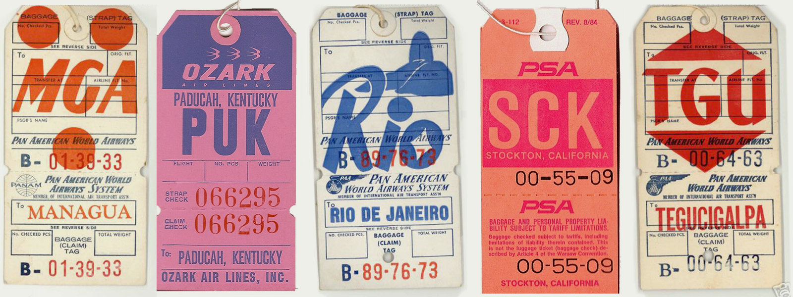
There is a sense of nostalgia about printed matter from the past. Since nostalgia is closely related to Romanticism, it made sense to find inspiration there for Wanderlust. Enter vintage travel bag tags. These labels would hang from your luggage while travelling. Our graphic hearts definitely started beating faster after these typographical gems. We immediately knew that this could be a great starting point for a wine label.
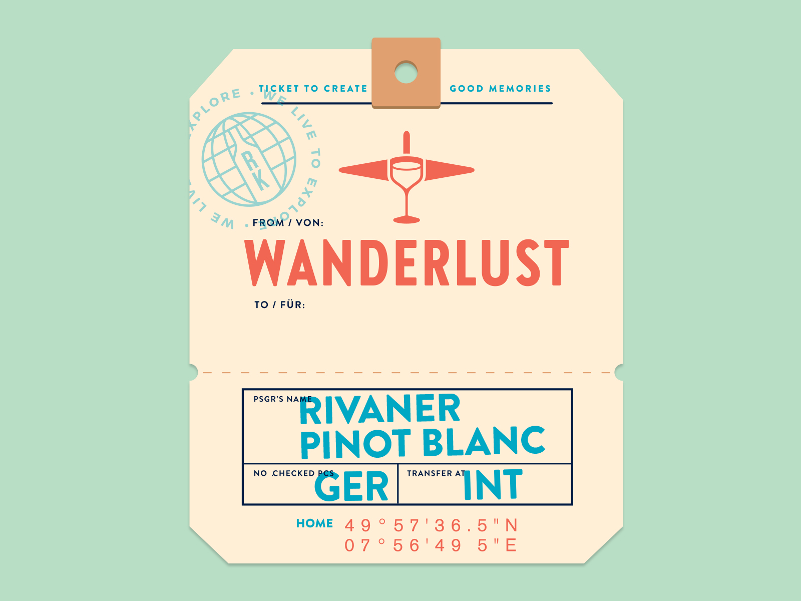
Work & Dam wouldn’t be Work & Dam if we didn’t try to come up with a clever logomark which embodies two visual elements and combine them into one original symbol. So we did. And frankly, we think we succeeded with flying colors. Fortunately, so did the client.
By combining the wineglass to represent the product and a plane to represent the love for travel, we combined the brand essence into one mark.
Finding the perfect typeface for the logotype took some time. We knew we wanted to invoke a subtle sense of nostalgia. We also wanted something narrow or condensed, since the name is quite long. After a considerate amount of time, we found out that HVD Fonts have designed a condensed version of Brandon Grotesque. Bold, condensed but a warm touch with its rounded corners: this typeface ticked all the boxes for the logotype and the brand identity.

social content
We live in a time where basically any B2C brand needs to have an online presence on social media. Especially if the target audience spends on average hours daily on Instagram. So we helped them establish a social media strategy that reflects the modern adventurer lifestyle.
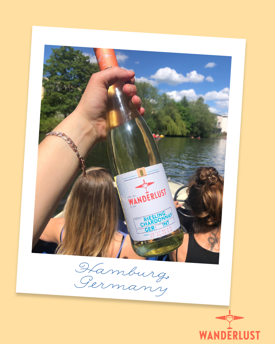
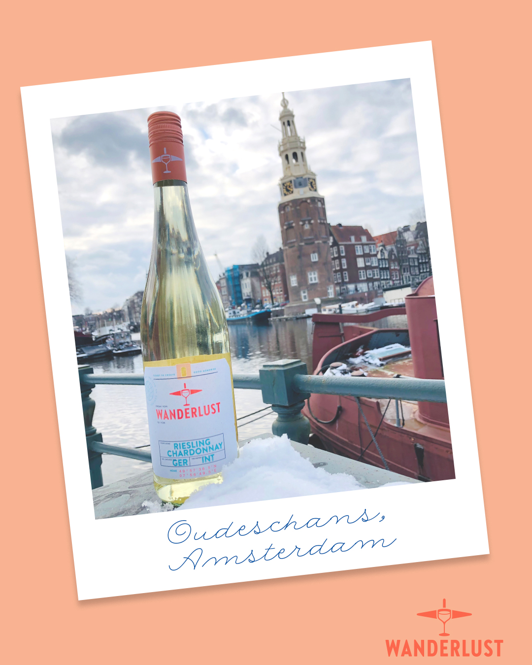
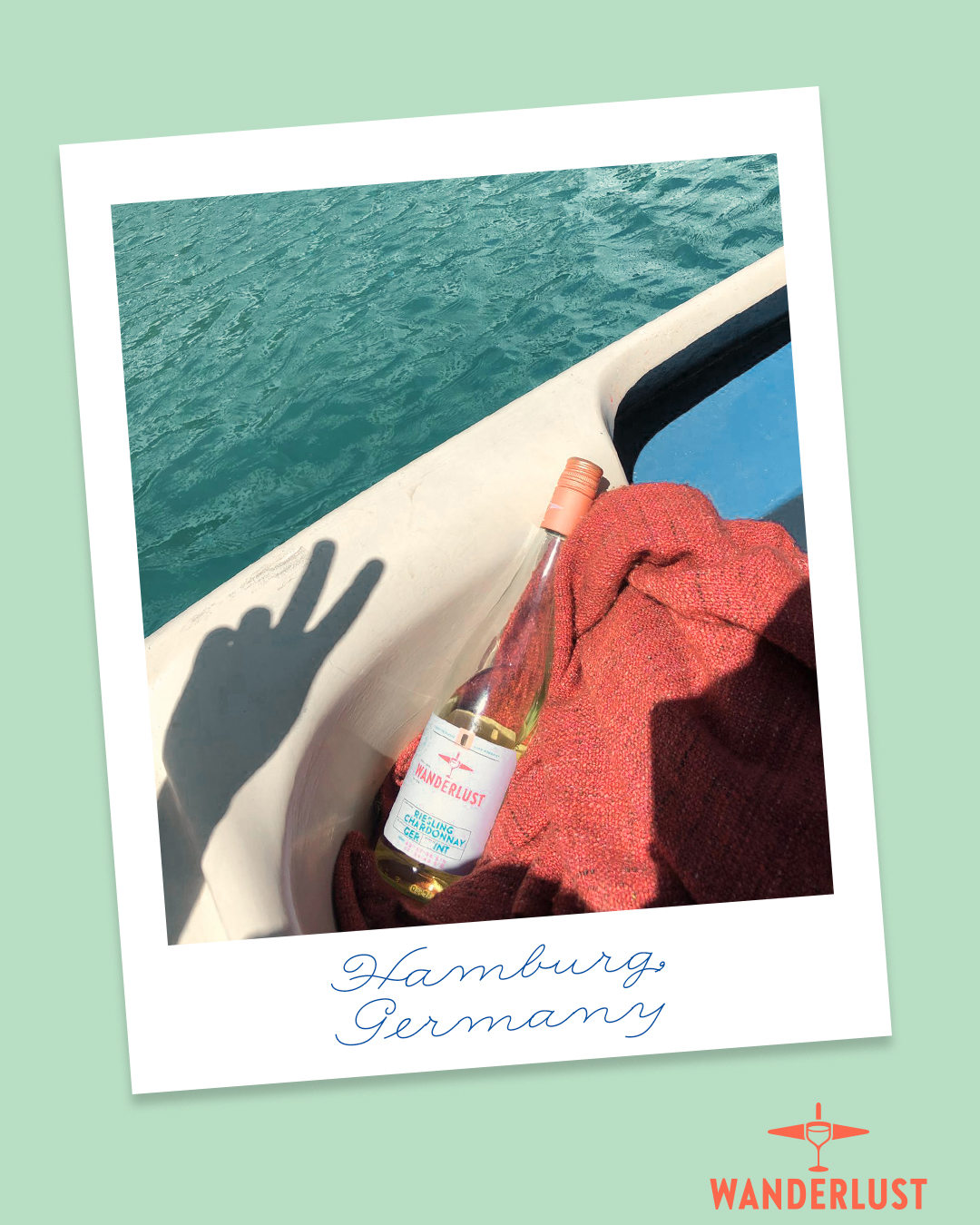
As a way to initiate more engagement with the target audience, we wanted to integrate user generated content in the feed. In order to ensure visual cohesion with the complete feed, we came with the solution to place UGC in a Polaroid-like frame. On the frames there’s space for a note that marks the location where the photo is taken. This solution ties in nicely with the rest of the identity, with its slightly nostalgic appearance.
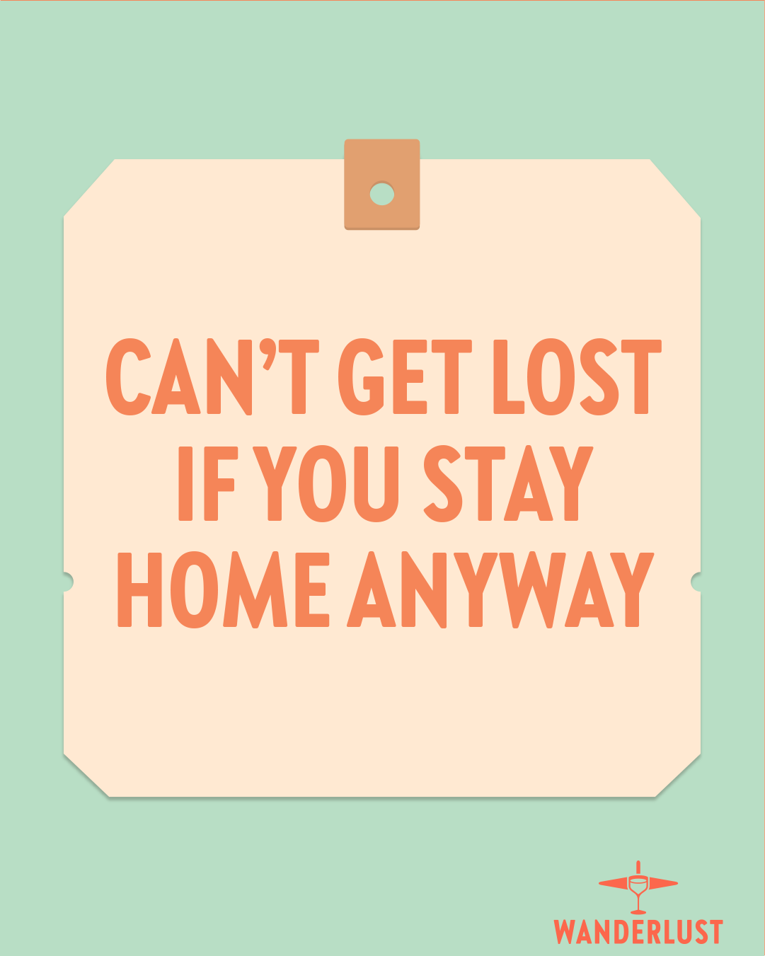
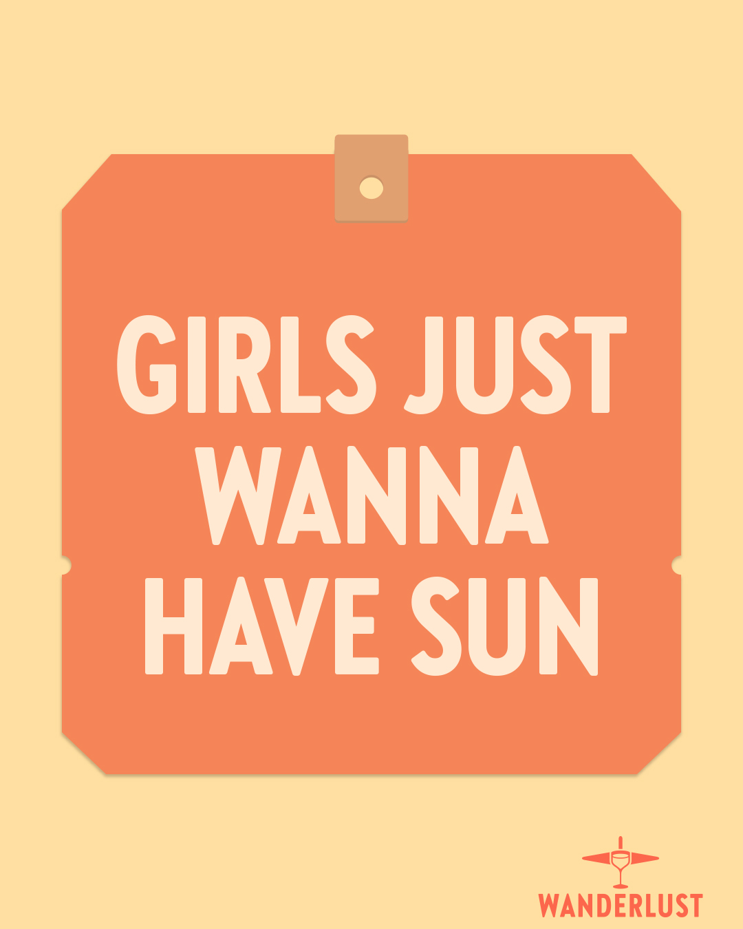
Variety is the spice of life. Therefore, in addition to a connecting and an inspiring content pillar, we also created one with the goal of entertaining. This resulted in typographic posts as a break from all the photography. We've created relatable one-liners & witty jokes that hopefully bring a smile to some faces. The easiest way to describe these are ‘memes in a Wanderlust format’. Millennials are the target audience, after all.
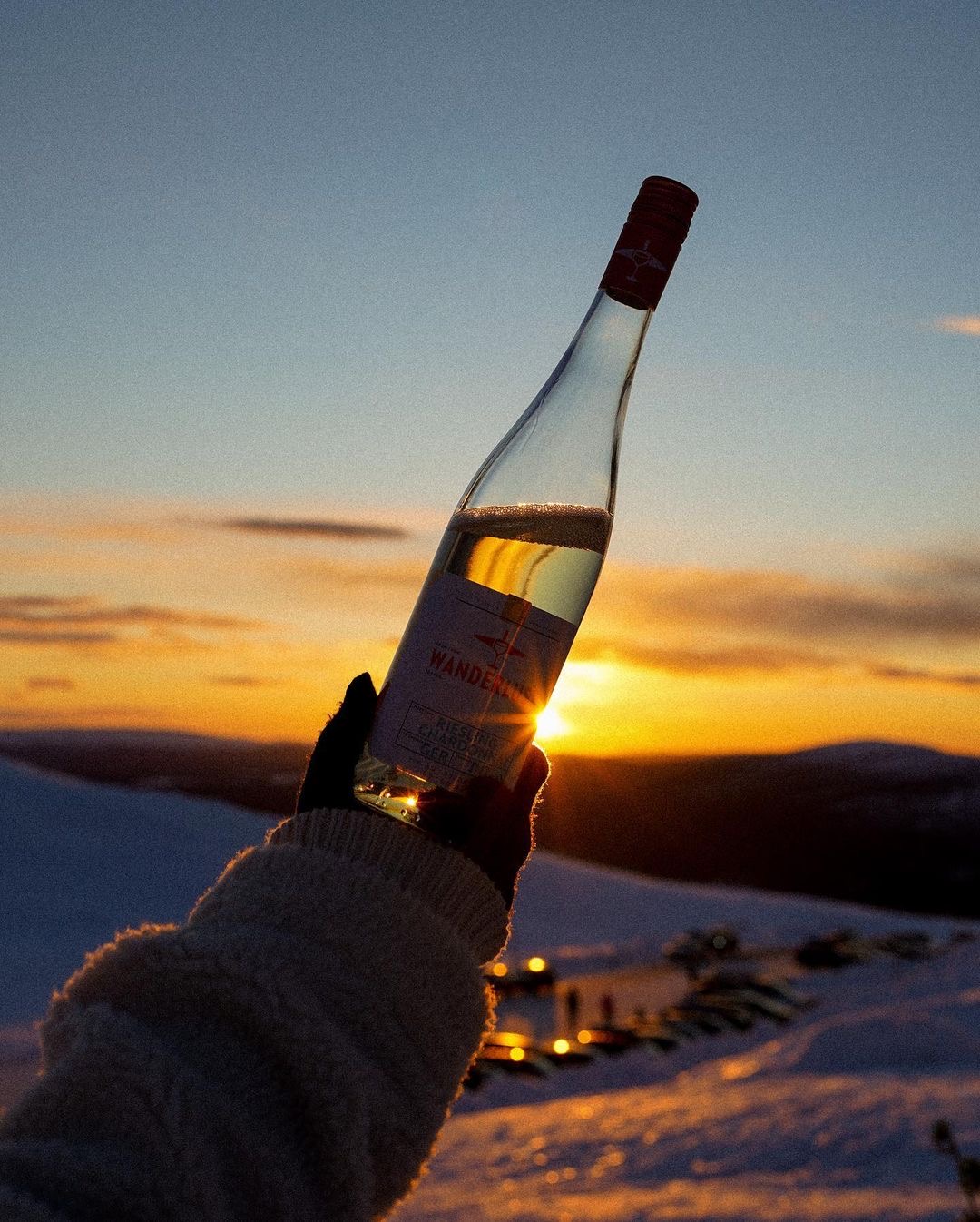
Right now Wanderlust is available in Germany, Finland, & Canada. Follow them on Instagram for their next destination.




kind words
During his work for Reh Kendermann, Sebastiaan fully demonstrated his knowledge of creating a new brand. He was able to work independently, carrying out all tasks to our total satisfaction and was quick to adapt to new situations or customer requests.
Furthermore, Sebastiaan showed very good interpersonal skills, was always reliable and creative. The cooperation with him was very pleasant and cooperative due to his open and helpful manner. We would highly recommend Sebastiaan!
Julia Lambrich
Brand Manager Wanderlust, Reh Kendermann
Ready to raise your brand to the next level? We'd love to get to know you. And if there's a match — We'll be sure to make some dam good work.
Send us your dreams & memes at:
Email: hello@workanddam.com