Over the years I’ve experienced clients that would compare the colors of their printed business card with the design on the screen. They would hold the card next to the screen and be surprised it’s not the same. Why they ask me? And with that question, this blog article was born.
When it comes to the visual aspects your brand identity, it should come as no surprise that color is an essential element. It can evoke emotion, set a mood, and convey a message. Once you’ve figured out the color palette for your logo or brand identity, you’d think it’s pretty simple, right? You probably know that each color has its own corresponding code and boom, there you go. Unfortunately, it’s a bit more complicated than that. In this article we'll break down the three main color systems used in graphic design: RGB, CMYK, and Pantone. Let's dive in.

RGB
A design proposal is almost always first presented digitally. Whether it's on a laptop or connected to an external monitor, the first creative concepts are almost always being shown through a screen. So let’s start with screen colors: RGB.
RGB stands for red, green, and blue, and it’s a color mode used for screens: so that’s digital displays such as computer monitors, TVs, and mobile devices. In the RGB color model, colors are created by mixing varying amounts of red, green, and blue light.
If you would look really closely to a screen, you can see the pixels. These are tiny sources of light and are always either red, blue and green. By mixing these light sources in different ways, you can create all colors. When you combine these three primary colors at full strength, they create white light, and when they are absent, they create black.
RGB color values are represented as three numbers ranging from 0 to 255, indicating the intensity of each color. If all three are at 0, you get black. And if all are at 255, you’ll get white.
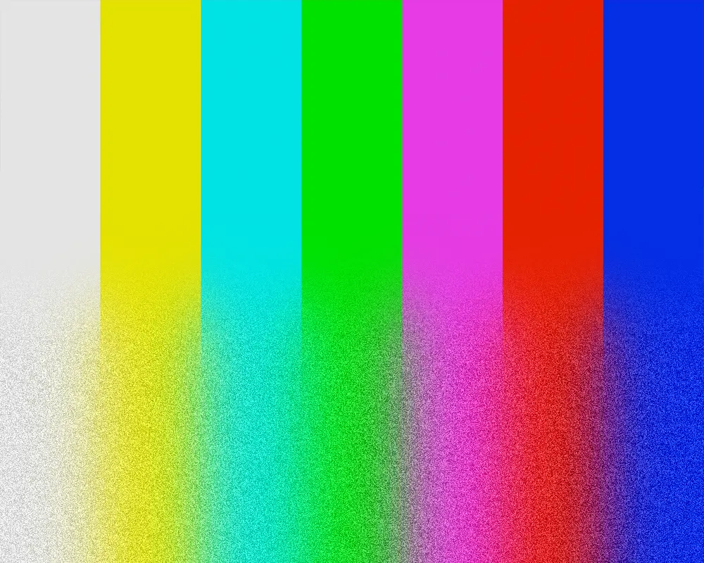
While RGB is the standard color system for digital design, it is important to keep in mind that different screens can display colors differently. Factors such as screen resolution, color gamut, and color calibration can all impact how colors are perceived on a screen. That’s all a bit too technical for now, but the thing to remember is that the exact same color, with the same RGB values, can look differently on different devices. There could be subtle differences in the colors, so before picking the color, it’s a good idea to see it on multiple devices. So check it on a laptop, monitor and phone to ensure that nothing funky happens.
The nice thing about screen colors is that you have a wide range of options. Especially super bright colors, such as neon pink or bright blue. And if you don’t like those, for websites there are about 16,777,216 color options to pick from. Plenty of choice.
TLDR: Colors on screens get brighter when you add more color. The exact same color can look slightly differently on different devices. RGB colors can get really bright.

CMYK
Enough about screens, let’s talk about ink! CMYK stands for Cyan, Magenta, Yellow, and Key (black). This color system is used primarily for print design and is based on the idea that all colors can be created by combining different amounts of cyan, magenta, yellow, and black ink.
When all four colors are combined at full strength, they create black, while absence of color creates white. Basically the opposite of screen colors, remember? The more ink we add, the darker it gets and the the lighter your color is, the less ink is being used.
CMYK color values are represented as four numbers ranging from 0 to 100, indicating the percentage of ink that is being used. If all four are at 0, you get white, which is in fact the absence of ink (since the paper is white). And if all are at 100, you’ll get a very rich black.
When creating designs for print, it's important to work in CMYK color mode to ensure that the colors appear correctly on the final printed piece. However, not all printers are created equal. Different printers use different ink formulations and printing processes, which can impact how colors appear on the final printed piece.
TLDR: CMYK colors represent how much ink the printer is going to use to achieve that color. The more ink you add, the darker it gets.
Pantone
So by now, you may have noticed that not colors can look slightly different, because printers and monitors differ from each other. Then you think to yourself, GEEZ, I just want to have exactly the same color and use this everywhere.
If that sounds like you, than Pantone is there help out. This is a standardized color matching system used in the printing industry. Each Pantone color is represented by a unique number, allowing designers and printers to communicate about specific colors with precision. The Pantone system includes both solid colors and metallic colors, as well crazy bright neon colors.
When working with Pantone, your colors can get way more brighter when compared with CMYK. However, the downside is that this a way more costly way of printing. For small amounts of printing materials, this printing method is often not feasible.
When working with Pantone colors, it's important to keep in mind that they may appear differently on different printing materials. Pantone colors are intended to be used on white or light-colored paper, and may not appear as intended on darker materials. Additionally, while Pantone colors can be reproduced using CMYK printing, the final result may not be an exact match.
TLDR: Each Pantone colors represent one specific code that is everywhere exactly the same, so that you exactly know what you color you’re getting. This precision comes with a price though.
In conclusion
RGB, CMYK and Pantone: Each medium has its own unique characteristics and limitations, from the way light interacts with pixels to the intricacies of ink on paper. While we strive for color harmony and consistency, it's important to remember that the screen and the printed page are two different worlds.
Understanding the differences between these color modes is important for achieving accurate and consistent colors in graphic design. However, when it comes to comparing printed colors with those displayed on the screen, it's like trying to compare apples and oranges. Or in this case, slightly duller oranges with slightly brighter oranges.